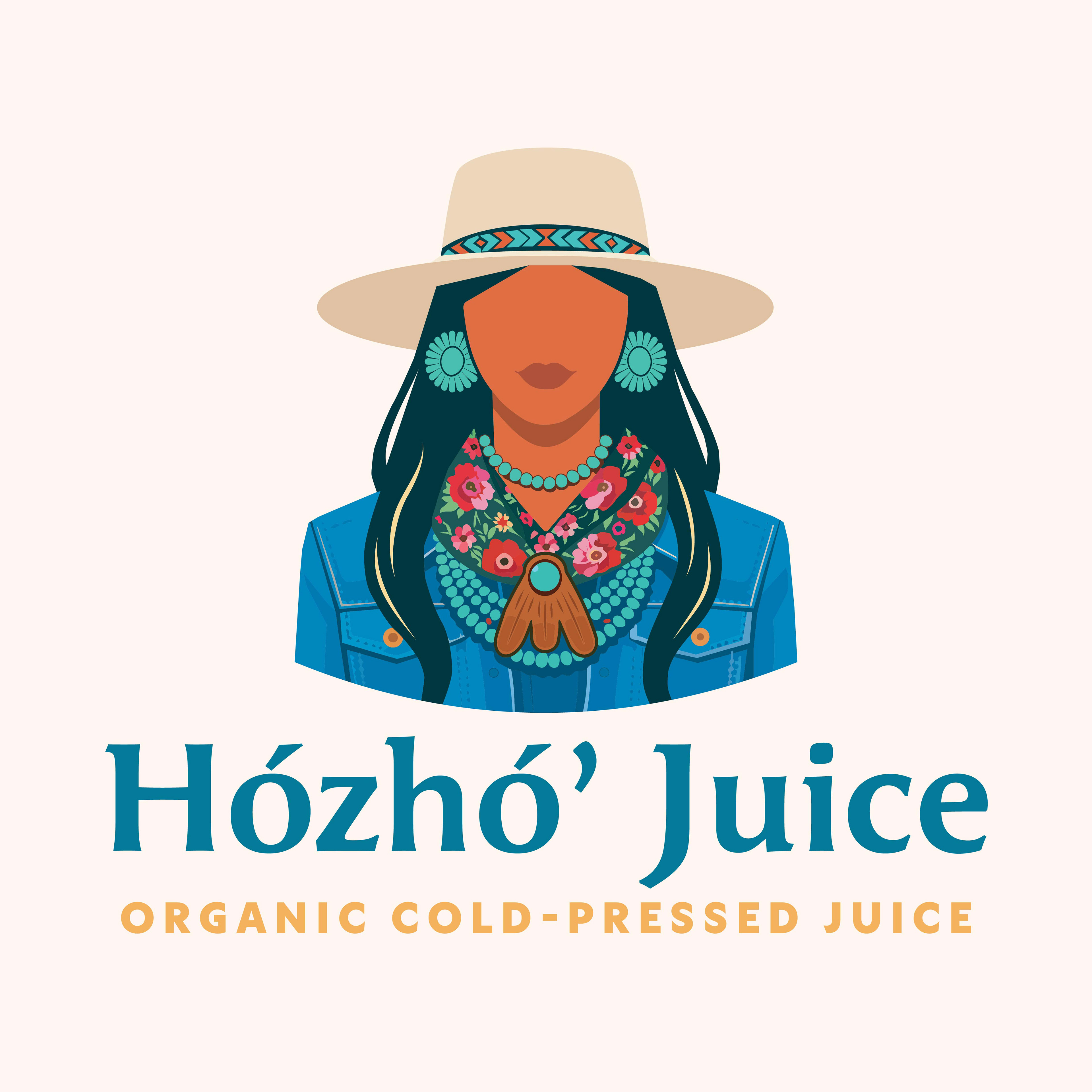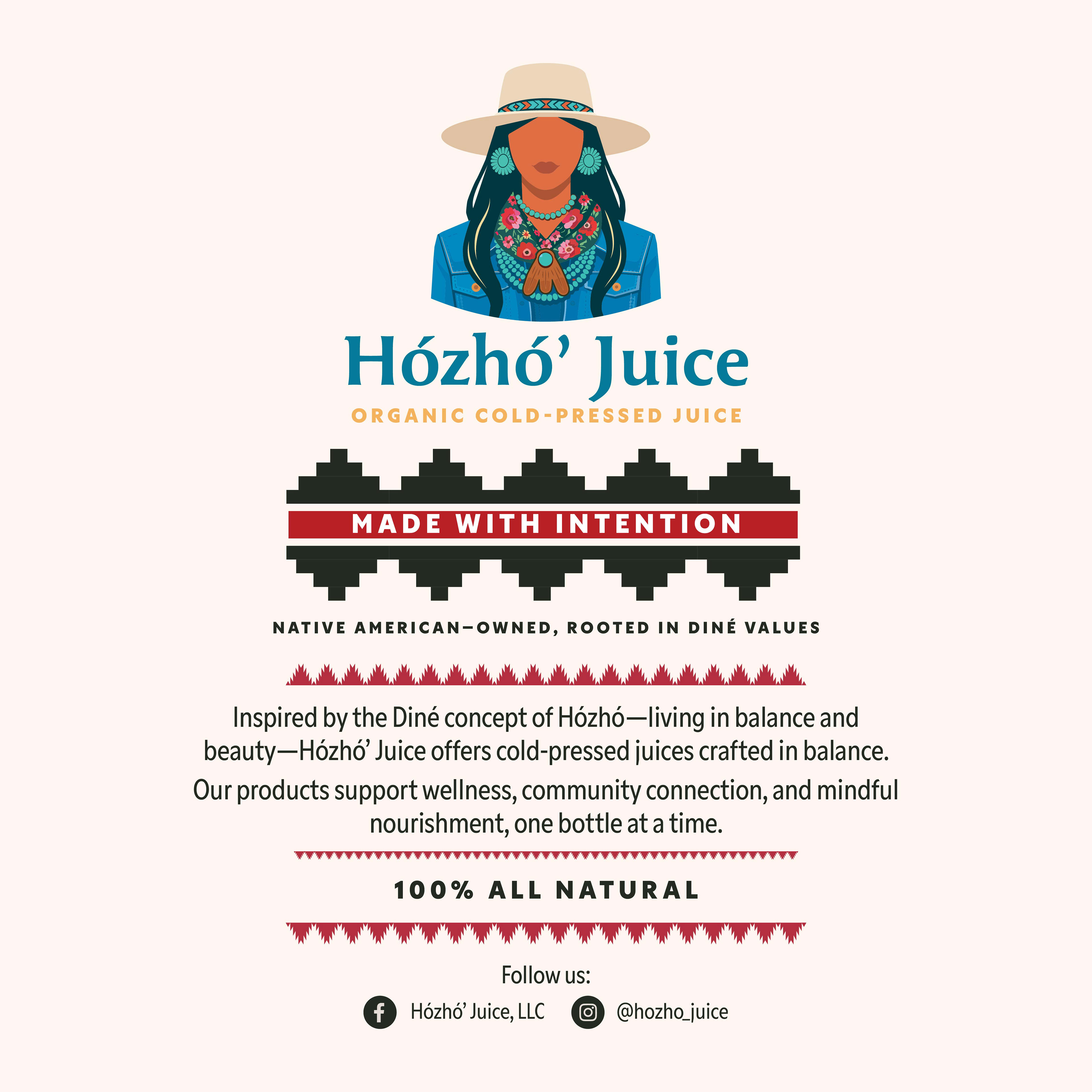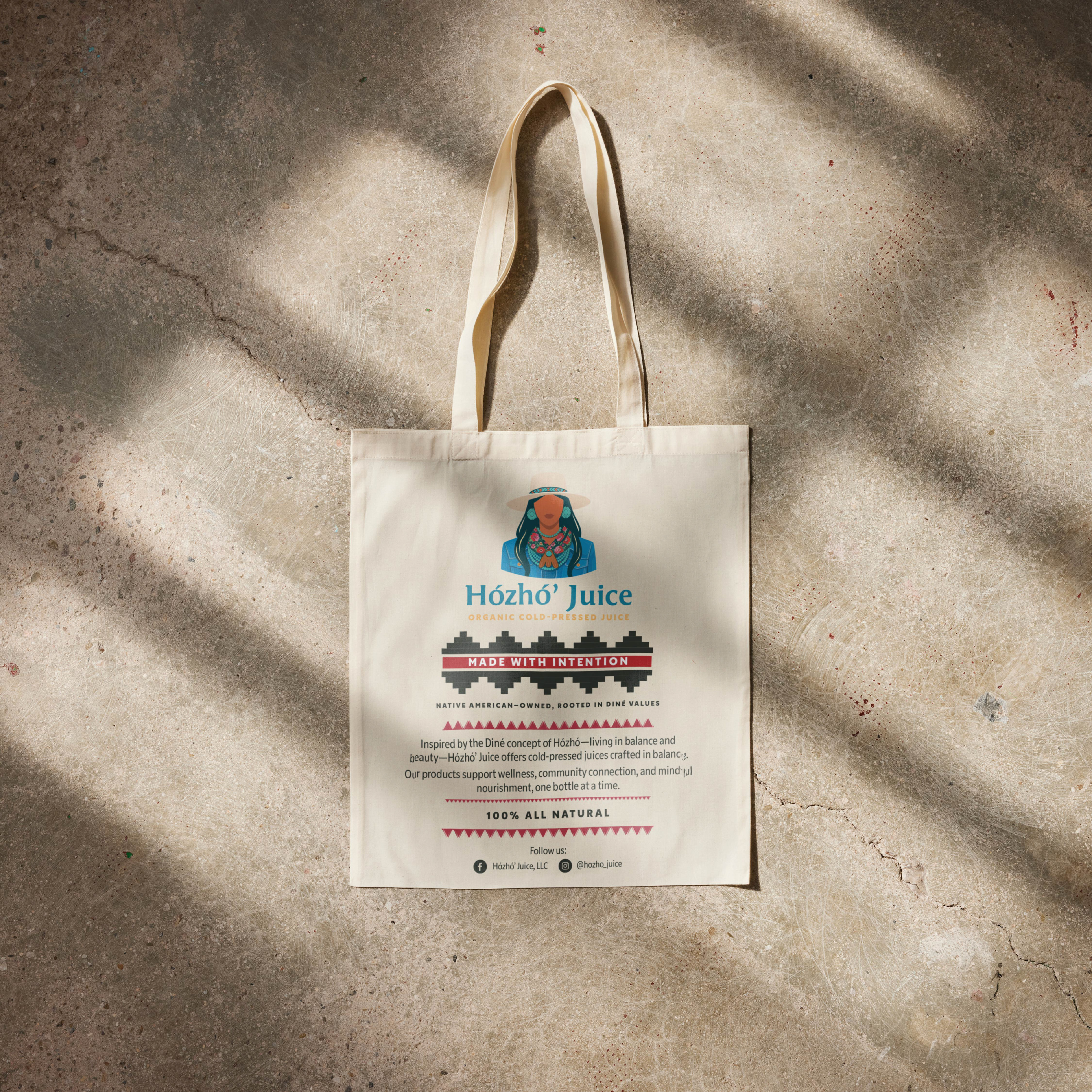


Hózhó’ Juice is a Native American–owned cold-pressed juice company rooted in the Diné principle of Hózhó—living in balance, harmony, and wellness. This project was a full brand identity redesign created in close collaboration with a Diné entrepreneur serving her local community and reservation.
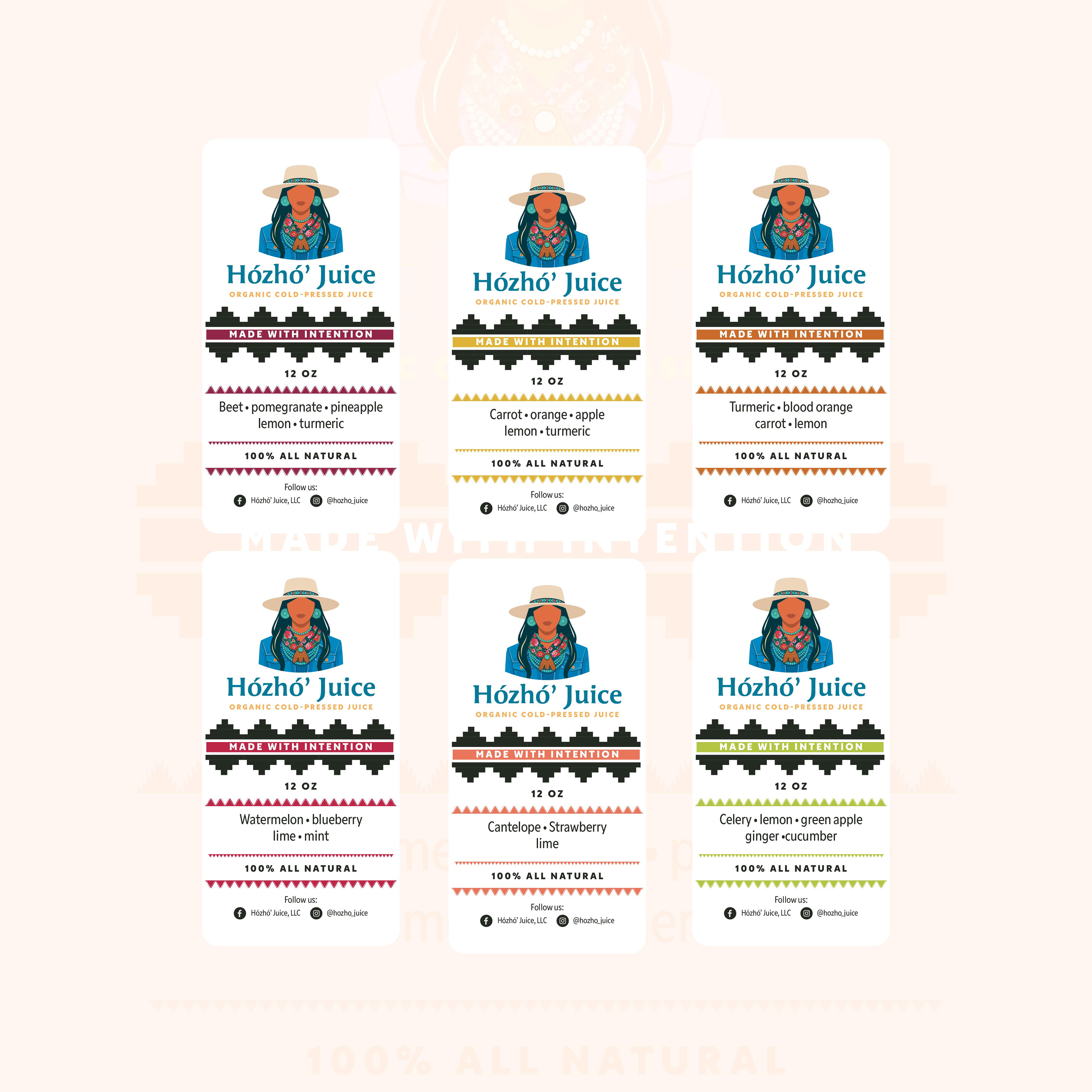
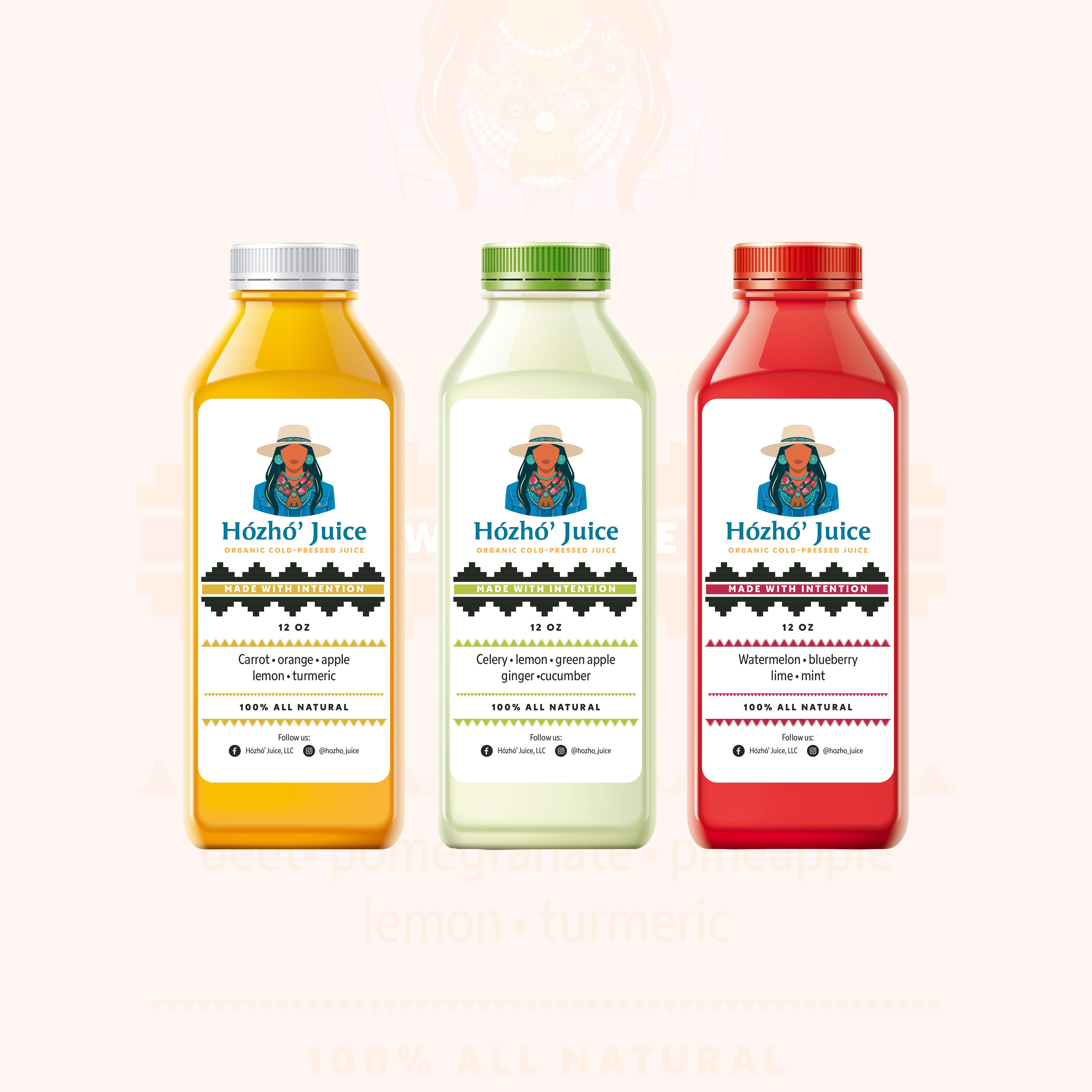
Approaching the work as a cultural and visual narrative, I began with the meaning of the name itself and built the identity outward. Rather than forcing the logo into rigid monotone conventions, the brand centers a richly illustrated emblem—allowing cultural detail, symbolism, and storytelling to remain intact. The primary artwork depicts a Diné woman rendered in a contemporary illustration style, wearing culturally resonant elements including turquoise jewelry, a western hat with a beaded band, and a traditional floral Diné scarf secured with a leather scarf holder.
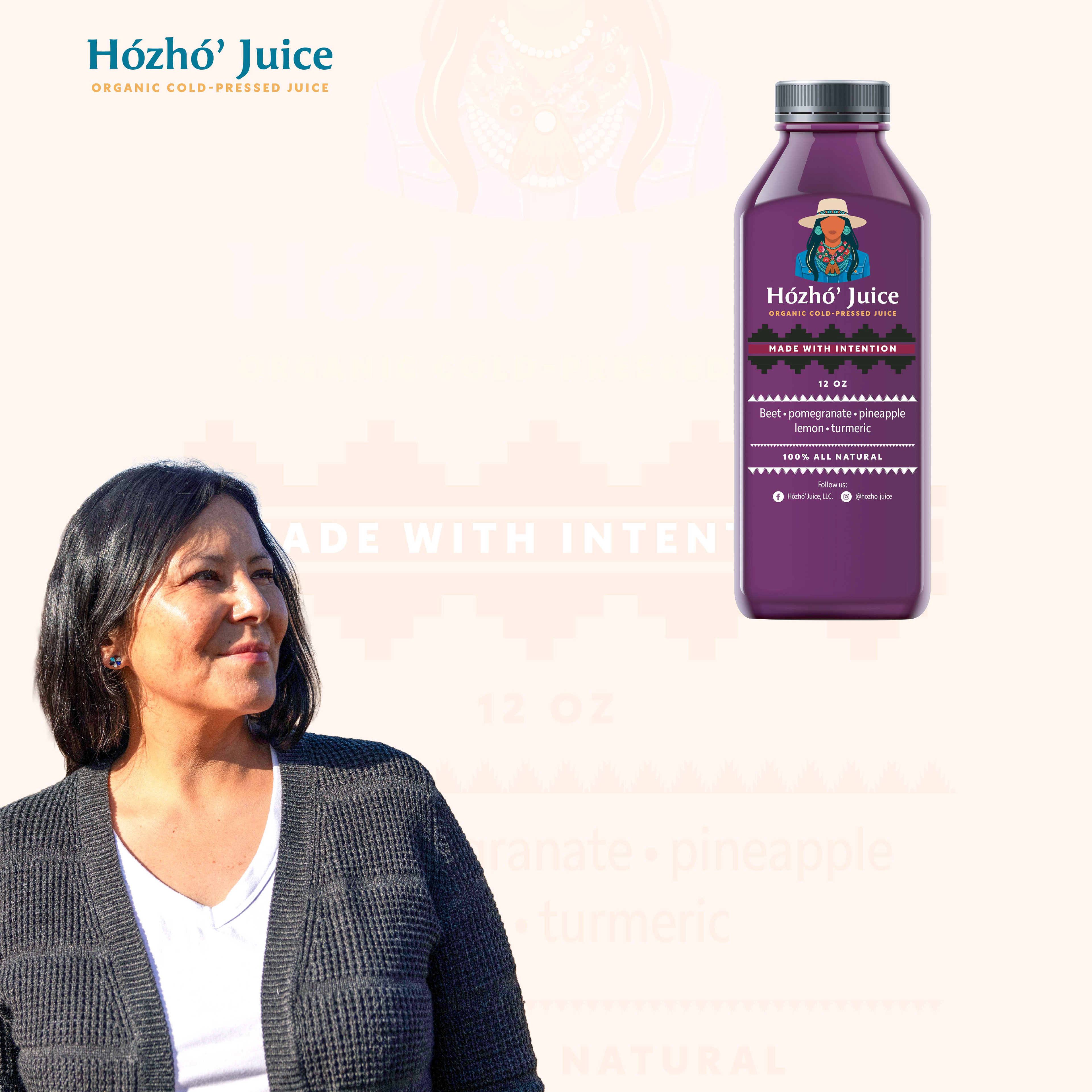
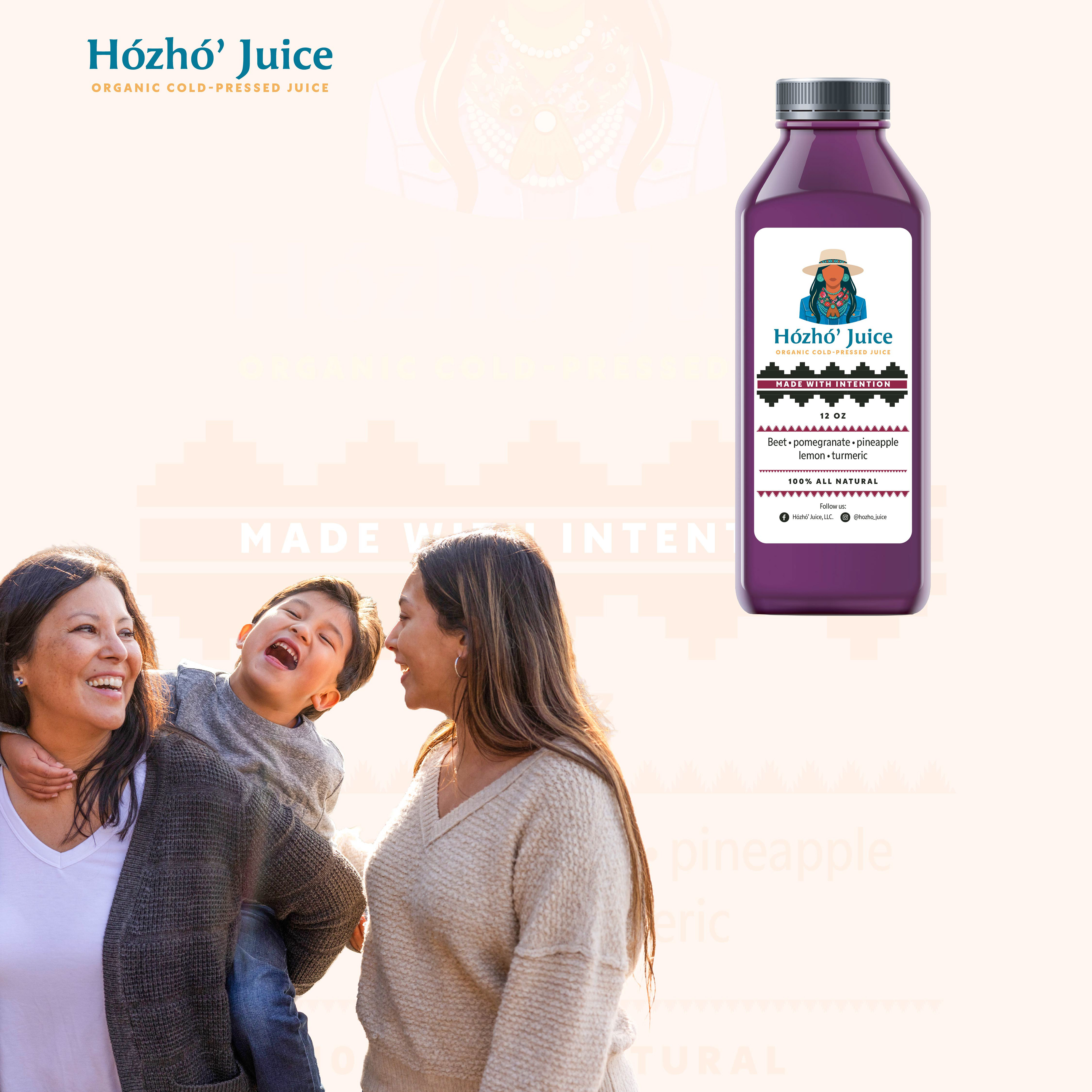
The visual system balances restraint and vibrancy: typography is clean and monotone-friendly for flexibility, while the illustration carries color, depth, and cultural specificity. Supporting assets include a cold-pressed juice bottle label and a branded tote bag, both incorporating Diné-inspired geometric motifs and pattern language. In addition to design execution, I helped refine brand copy to clearly articulate values of intention, wellness, and community connection.
In addition to visual identity and packaging design, I collaborated closely with the founder to refine brand language and messaging—developing copy that reflects Diné values of balance, wellness, and intentional living. This included finessing product descriptions, tone of voice, and brand statements to ensure the language carried the same care, clarity, and cultural intention as the visual system.
Tools: Adobe Illustrator
Deliverables: Logo redesign, brand identity system, bottle label, tote bag
Focus: Cultural brand identity, illustration-driven design, packaging systems, brand messaging & copywriting, Native-owned entrepreneurship
Deliverables: Logo redesign, brand identity system, bottle label, tote bag
Focus: Cultural brand identity, illustration-driven design, packaging systems, brand messaging & copywriting, Native-owned entrepreneurship